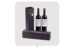
In today's highly competitive market, product packaging plays a vital role in attracting customers and enhancing brand perception. The
design of pen packaging gift boxes should be creative and visually appealing, while also aligning with the latest design trends. This article
explores how to add creativity to pen packaging gift boxes through innovative design concepts and thoughtful color selection.
Section 1: Incorporating Innovative Design Concepts
To make pen packaging gift boxes more creative and engaging, the following design concepts can be incorporated:
1. Minimalist Design: Minimalism focuses on simplicity and elegance. By embracing clean lines, minimalist typography, and uncluttered layouts,
pen packaging gift boxes can convey a sense of sophistication and modernity.
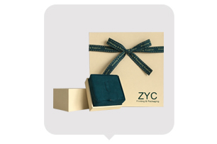
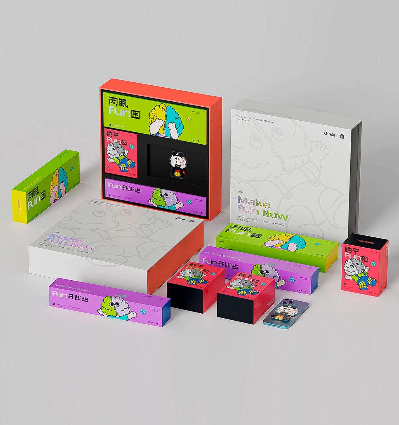
2. Interactive Elements: Adding interactive elements to the packaging can create a delightful unboxing experience. This could include pull-out
compartments, hidden messages, or pop-up mechanisms, all of which surprise and engage the customer.
3. Environmental Sustainability: With growing awareness and concern for the environment, eco-friendly packaging designs are gaining popularity.
Using materials such as recycled paper, vegetable-based inks, or biodegradable plastics for pen packaging gift boxes can appeal to environmentally
conscious consumers.
Section 2: Color Selection for Pen Packaging Gift Boxes
Colors play a significant role in evoking emotions and capturing attention. By carefully selecting colors that resonate with the brand and target
audience, pen packaging gift boxes can leave a lasting impression. Consider the following color selection strategies:
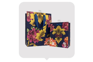
1. Reflecting Brand Identity: The colors chosen should align with the brand's personality and values. For example, if the brand portrays elegance and
luxury, muted and rich tones like deep blues or burgundy can be used. On the other hand, vibrant and bold colors might be suitable for brands
targeting a younger demographic.
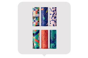
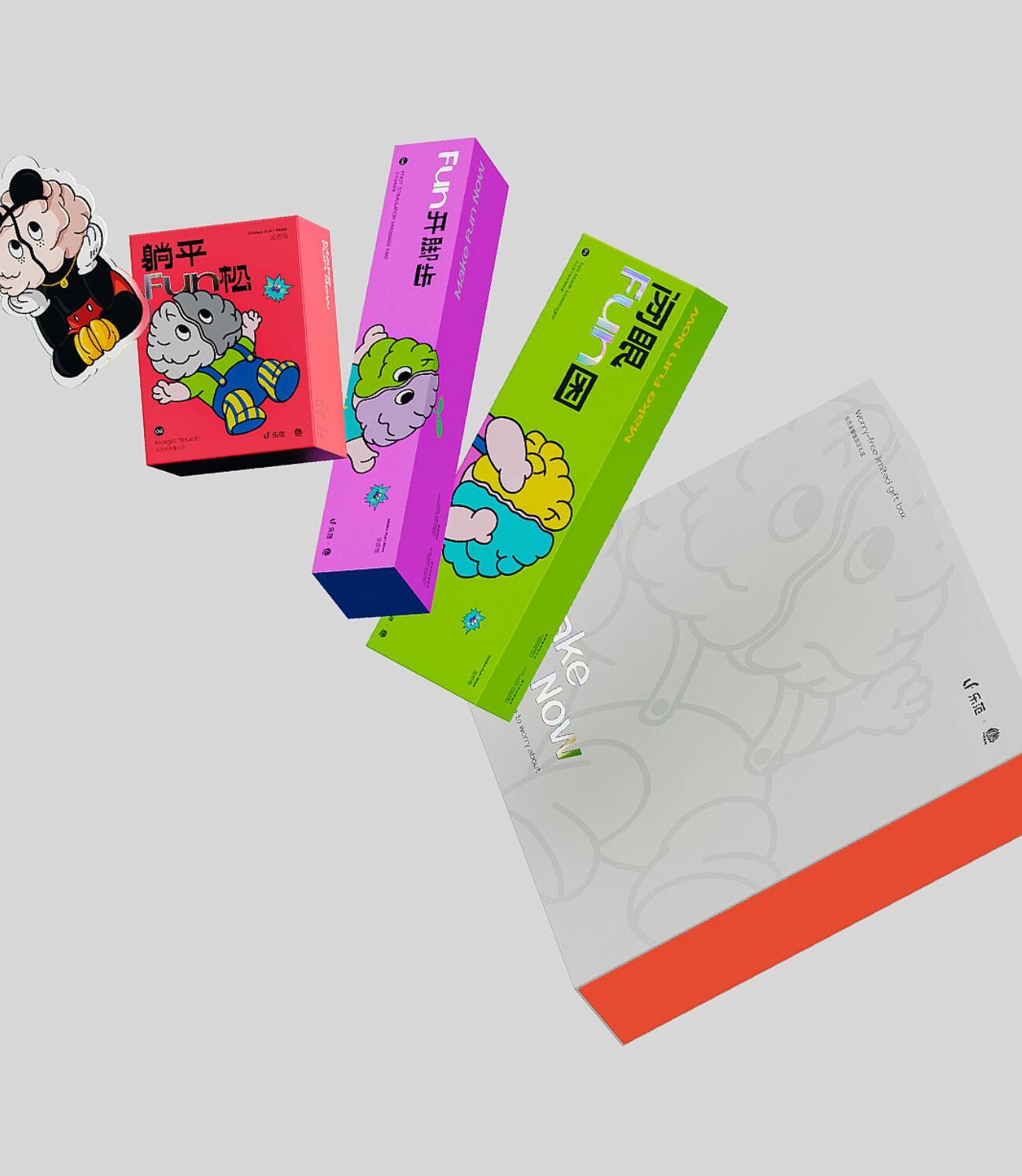
2. Harmonious Color Combinations: Using a harmonious color scheme can enhance the visual appeal of the packaging. The use of complementary
colors (opposite on the color wheel) or analogous colors (located adjacent to each other) can create a pleasing and cohesive design.
3. Emphasizing Contrast: Contrast can make the packaging stand out and catch the eye. Combining light and dark shades or utilizing contrasting hues
can create visual interest and highlight specific elements of the packaging design.
Section 3: Personal Perspective and Conclusion
In my opinion, the design of pen packaging gift boxes should strike a balance between creativity, functionality, and brand identity. It is crucial to be
innovative and think outside the box while considering the practical aspects of manufacturing and transportation. Additionally, incorporating sustainable
materials and practices can demonstrate a brand's commitment to the environment, which is an essential factor in today's conscious consumer market.
By incorporating innovative design concepts and selecting colors thoughtfully, pen packaging gift boxes can become aesthetic representations of the
brand and create a memorable unboxing experience. Ultimately, an effective packaging design can contribute to increased brand recognition, customer
satisfaction, and sales.
In conclusion, the design of pen packaging gift boxes should be imaginative, visually appealing, and considerate of the latest design trends. By embracing
minimalist design, incorporating interactive elements, and prioritizing environmental sustainability, brands can create packaging that engages customers.
Furthermore, careful color selection to reflect brand identity, focus on harmonious combinations, and emphasize contrast can enhance the overall appeal.
By combining creativity with functionality, pen packaging gift boxes can make a lasting impression in today's competitive market.