Packaging plays a crucial role in attracting potential consumers and creating a lasting impression. When it comes to toy products,
the design of their packaging must capture the attention and imagination of both children and parents. This article will explore the
design characteristics and trends seen in the packaging of toy products, incorporating the latest design concepts. It will be organized
into sections that provide a clear understanding of the topic, concluding with a personal perspective.
Section 1: Capturing the Essence of the Toy
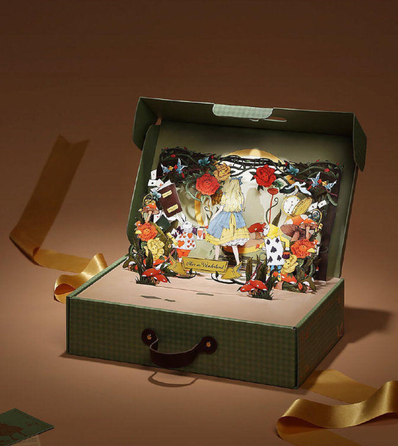
The packaging of toy products should reflect the essence of the toy within. This can be achieved through vibrant colors, whimsical illustrations,
and engaging typography. By portraying the toy's features and functions on the packaging, the design aims to encapsulate the experience a
child can expect. Additionally, the use of interactive elements, such as pop-ups, cut-outs, or augmented reality, can enhance the overall appeal of the packaging.
Section 2: Sustainability and Eco-Friendly Approach
The focus on sustainability and eco-friendly packaging has gained significant traction in recent years. Toy manufacturers are increasingly opting
for materials that are recyclable, biodegradable, or made from renewable resources. The design of toy packaging incorporates earthy tones, natural textures,
and minimalist patterns to convey an eco-conscious message. The integration of eco-friendly slogans and symbols further reinforces the commitment
to a greener future.
Section 3: Personalization and Customization
With the rise of digital technology, personalized and customizable packaging has become a prevalent trend. Toy brands are leveraging digital printing techniques
to offer unique packaging experiences to their customers. This includes the ability to personalize the packaging with a child's name, photo, or even customize
the packaging design. Such personalization adds a sense of exclusivity and creates an emotional connection with the consumer.
Section 4: Nostalgia and Retro Design
Nostalgia has always been a powerful tool in marketing, and toy packaging design is no exception. Brands are tapping into the nostalgia of parents by adopting
retro-inspired packaging designs reminiscent of their childhood. Vibrant color schemes, retro fonts, and classic illustrations evoke a sense of familiarity and
emotional resonance. This approach not only appeals to parents but also introduces a new generation to beloved toys from the past.
Section 5: Minimalism and Simplicity
In contrast to retro designs, minimalist packaging has gained popularity due to its clean and modern aesthetic. The use of simple shapes, neutral colors, and
concise typography conveys a sense of sophistication and elegance. Minimalist packaging focuses on highlighting the key features and benefits of the toy,
creating a visually pleasing and clutter-free experience. This design approach appeals to parents who value simplicity and a minimalist lifestyle.
Conclusion:
The design of toy product packaging continually evolves with the latest design trends and consumer preferences. By capturing the essence of the toy, incorporating
sustainability, personalization, nostalgia, and simplicity, brands create packaging that appeals to both children and parents. The future of toy packaging design lies
in striking a balance between visual appeal and environmental responsibility, while fostering an emotional connection with the consumer. Ultimately, the packaging
should not only protect and promote the product but also enhance the overall toy experience.