Packaging design plays a significant role in capturing consumer attention and influencing purchasing decisions.
The visual elements such as colors, patterns, and fonts chosen for packaging can convey messages about the
brand, product, and overall consumer experience. With evolving design concepts and trends, it is crucial to
understand the importance of visual communication in packaging design.
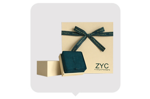
Color Selection:
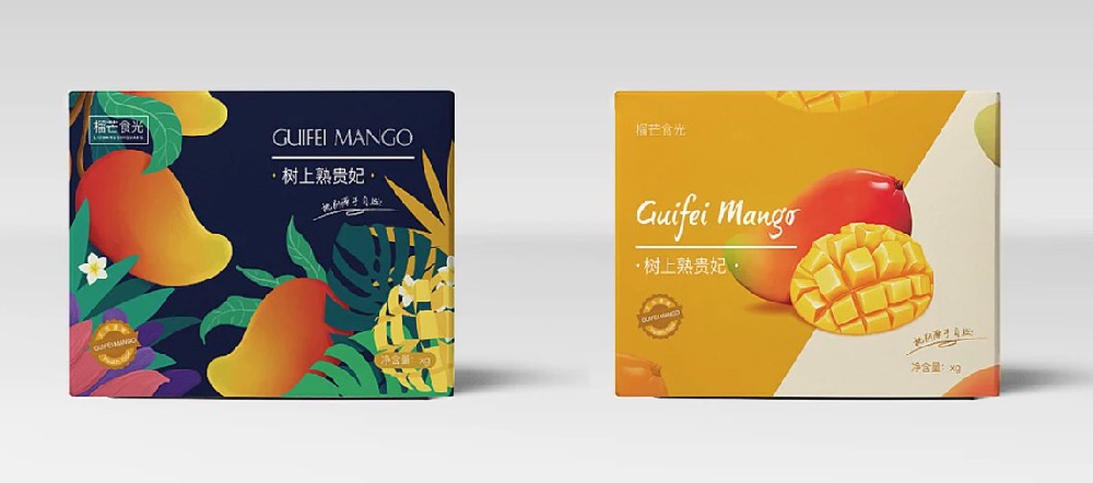
Colors have a profound impact on human psychology, and they can evoke emotions, convey meanings, and
differentiate products. When selecting colors for packaging design, it is essential to consider the target audience
and the brand's identity. Bright and bold colors often attract attention and create a sense of excitement, while soft
pastel colors can evoke a feeling of calmness. The color palette should reflect the product's qualities and values,
creating a visual harmony that resonates with consumers.
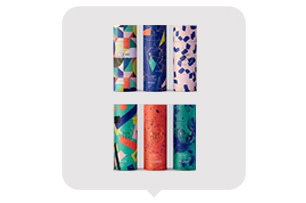
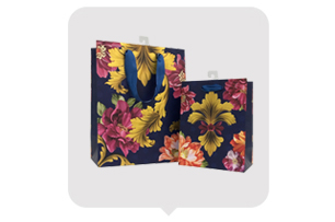
Pattern Selection:
Patterns in packaging design can add visual interest, create brand recognition, and enhance the overall aesthetic
appeal of the product. They can be inspired by nature, cultural motifs, or abstract designs. Geometric patterns convey
a sense of modernity and order, while organic patterns evoke a feeling of nature and authenticity. The choice of
patterns should align with the brand's image, product attributes, and target market. It is crucial to strike a balance
between visual appeal and readability, ensuring that the patterns do not overwhelm or distract from the core message.
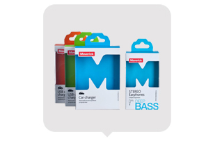
Font Selection:
Fonts play a vital role in packaging design as they contribute to the overall visual hierarchy and message clarity. The font
chosen should align with the brand personality and cater to the target audience. Sans-serif fonts are generally considered
modern and clean, while serif fonts can evoke a sense of tradition and elegance. Handwritten or script fonts can add a personal
touch and create a sense of craftsmanship. It is important to ensure legibility, especially when displaying product information
or instructions. Balancing creativity with readability is key to effectively communicate the brand's message through typography.
The Integration of Visual Elements:
In packaging design, the selection of colors, patterns, and fonts is not independent but rather interconnected. They should work
harmoniously to create a cohesive and visually appealing design. The colors should complement the patterns and fonts, enhancing
their impact and ensuring consistency with the brand's visual identity. The visual elements should be strategically placed to guide
the consumer's attention and highlight the essential features of the product. Careful consideration of the spatial arrangement and
balance is essential to create an effective and compelling packaging design.
Conclusion:
Visual communication in packaging design is a powerful tool for brands to convey their message and connect with consumers. The
careful selection of colors, patterns, and fonts in packaging design can evoke emotions, enhance brand recognition, and create a
memorable consumer experience. As design trends continue to evolve, it is important to stay current and adapt to the ever-changing
consumer preferences. By understanding the principles of visual communication and integrating them effectively, brands can create
packaging that not only stands out on the shelves but also resonates with consumers on a deeper level.
In conclusion, the art of packaging design lies in the thoughtful combination of colors, patterns, and fonts. Moving forward, designers
should continue pushing boundaries, experimenting with new ideas, and staying true to the brand's essence to create packaging that
captures both the eye and the heart of the consumer.